
Best Mobile Apps with Great UI Examples [Our Top 10 Picks]
It does not matter how unique your mobile app idea is. Even if it is a trendsetter idea, the main elements that make your mobile app adored are the feature-rich, seamless navigation and exceptional functionality with an intuitive user interface (UI).
If your app does not impress your target audience, all your efforts could go to waste if your mobile app does not have user-friendly functions. It will simply show off as a good mobile app “idea” but a poorly designed user interface. If users see this happening in your app, it will simply push them to go to your competitor or rival mobile app. The mobile app redesign and overall design are the most important part of the whole mobile app design and development process. You should avoid making any blunders in the first go. Your mobile app should make a stand-out first impression.
So, if you are interested in knowing how to create a brand-reflective and unique mobile app design, we have gathered the top ten best picks as examples for you to choose from.
What is UI Design?
A user interface or UI is a contact point of human-computer communication and interaction in a device or a computer. For instance, when you tap on any kind of app on your device, it opens. What you see in the app or on the screen is the user interface of the app. The user interface in the mobile app is very touch-sensitive. Some may be more sensitive than others in terms of graphical elements and display. So, the user interface allows users to interact with the app, its functionalities, and the content provided.
More mobile app ideas for you: 10 Best Apps for Couples to Build a Stronger Relationship in 2024.
1. Spotify
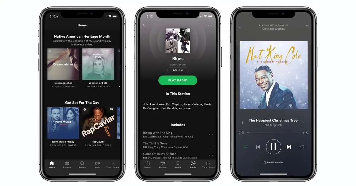
Spotify is known for delivering the best music experience to its users, and the secret lies in the user interface. For a long time, most UI/UX designers and developers have been trying to create a music app using different colors when designing interfaces. They have also attempted to make music apps similar to Spotify.
Colors are a good thing when it comes to music apps, especially when you stick with one designated color. It creates a stronger effect on users. More colorful UIs lure the audience immediately. The colors you select should match the aesthetic of your app. In this case, Spotify chose an electric green color against a black background on the app, which is the same as the logo design. This makes music streaming apps even more popular since they can choose amazing color gradients as well. These colors can convey emotions and make the whole app more relatable. Some music apps also offer a customized approach where users can choose the color they want. That makes the user feel even more special, believe us. Colors can give your music app a new dimension and make it look much more entertaining.
Are you interested in music apps? Do you wish to learn how to make one? Then read our blog, “How to Make a Music App: A Step-by-Step Guide.” It is a simple guide that will give you the best suggestions for developing interactive and fun music apps.
2. Diet & Fasting Apps
Another mobile app UI design option for health and wellness is a fasting app. It is one of those amazing apps that can track your eating habits and fasting progress. These apps can also deliver fasting advice and healthy eating counseling and coaching. These apps allow users to put in their BMI (Body Mass Index) details and track them by the month. There are other features that these apps track, such as weight, sleep time, resting heart rate, and other parameters easily with this UI mobile app.
The best thing about fasting apps is that they require minimal UI designs, making the user interface look less scattered, clean, and simply direct. With a good UI and solid color combination, it has detailed insights and analytics, but a cluttered mobile app in itself is not a good sign. Wellness apps should mimic the purpose of why users are using the app in the first place. For peace of mind, your app should not look cluttered, which could drive users away. The CTAs should look natural and not like a forced marketing effort or pop-up on the user interface every 10 minutes.
Fasting and wellness apps can have different features, such as the status of one’s health, body measuring, and water trackers, and they should act as a guide. They should include all these features that will make users stick to one app only. Here is the catch: if your app is well-designed and includes all these health-related features, make sure that you are not overdoing it on the app, but that will make users not feel the need to download another app that has a separate water tracking feature, or a sleep tracking feature, your mobile app will have it all.
Here is another healthcare-related mobile app blog to read: Top 10 Advantages of Healthcare Mobile Apps.
3. Glo Yoga
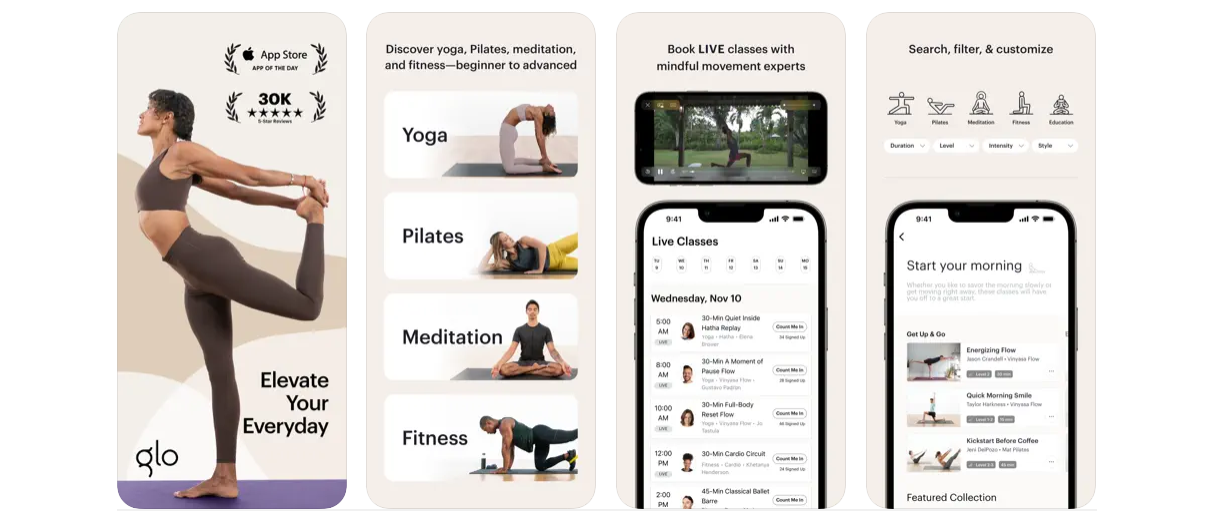
Glo Yoga is available both on iOS and Android. Additionally, it has its own website (this is a perk for mobile app owners when they own websites as well as apps). Moving on, Glo is one of the most downloaded yoga teaching and learning apps that attracts the right audience and keeps them as trusted users. This app will take you on a calm journey, first of all, because it delivers fun and helpful yoga methods. The user interface is flawless and calming as well. Adding to that calming journey.
The Glo Yoga mobile application provides enhanced user experiences since it is easy to use and the illustrations are clear and functional.
An informative read for you: What Is Mobile App Security? [8 Steps to Boost Your Apps Security]
4. Grubhub
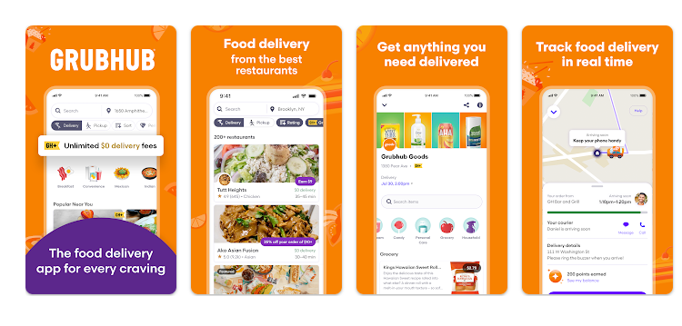
Grubhub is another mobile app design that we chose to add to the list of top 10 mobile app user interface designs because it serves just that. This is a highly simplified and linear food delivery app that has the best user interface and UX designs. The elements and the features further add to the overall aesthetic of the app and its purpose. Just one look at the app, and it gives a promising vibe to users.
Additionally, the mobile app design is vibrant, with colors that complement each other and the overall design is simple for anyone to understand how to use it.
Pro tip: If users spend too much time trying to discover and learn the app, it’s a bad sign.
Moreover, the Grubhub app design lets you track your food and where it is live. The CTAs are not forced either; they have a very natural approach to it and also provide you with nearby restaurants. The app and layout are clean and neat. Overall, the app is pretty polished and will give users a great first impression.
Here is a read for those who are interested in developing a gaming mobile app: our blog, “23 Best Mobile Games to Download in 2024.” Whether you want to download the app or learn what makes these gaming apps so special, you will find out after the read!
5. Robinhood
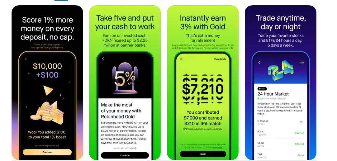
If you want to know how you can create a simple yet effective and highly tempting stock market trading app, you should consider the Robinhood app to see what strategies they used for a successful UI. The mobile app allows users to manage and view their money and wealth by providing them with risk assessments, market predictions, and the best investment goals.
Here, the mobile app designers have not tested out with many colors but perfectly broke up the onboarding flow to keep the mobile app visitors and users engaged. Lastly, the mobile app is simple to navigate and delivers a unique and fun experience to users with the correct and authentic information displays. This is one of the best UI design examples you want to see, which is why we have added it to the list.
Learn more about: The Essential Guide to App Store Optimization.
6. Cofe
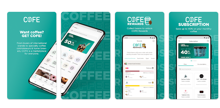
Cofe is a simple coffee-ordering app, but its design makes it one of the best apps of all time. Just look at its simplicity and clarity, and you will fall in love with it instantly. The mobile app has the secret of having a minimalistic touch to it. That is what attracts more users. Users will not want to use a complicated coffee app; they simply want a direct approach to their coffee and to get it. We mean, who would want to use so much brain just to order a cup of coffee, right?
The plan is to keep your coffee app, or whatever app idea you decide on, a minimalist approach. The simpler the app, the better it is. Additionally, the illustration and placement of features on this app are perfect, and it is exactly where users will look: the CTAs, the buy now options or pay now options, etc.
Here are a couple of more mobile app ideas to spark your creative side: Revive Your Inner Genius: Top 55 Apps for Creative Thinking [2024].
7. Paypal
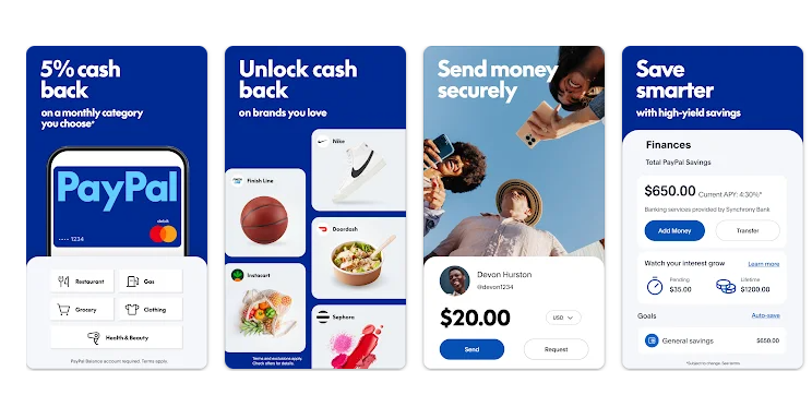
If you deal with international transactions, you must be aware of Paypal. It is one of the most trusted and preferred fund transfer portals all over the world. Users and even other businesses affiliate themselves with these services because it is that trustworthy.
The app design is sleek, simple, and impressive. Blue is the initial and only main color chosen, but other colors make the app look more complete and engaging. While designing the app, the UI/UX designers have entirely broken all the rules of monetary or banking app designs. The app is friendlier, fun to use and look at, and vibrant with a mix of color palettes. It looks amazing and highly enthralling. The app has several screens, each with a unique background, keeping in mind the key demographic. Furthermore, the app has a simplified UI with useful features and perfectly placed CTAs.
Learn more: Everything You Need to Know About Mobile App Quality Assurance.
8. Bigbasket
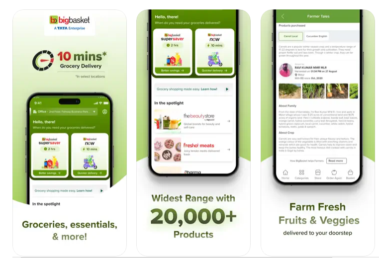
Bigbasket is a grocery delivery app. However, the mobile app’s design is different from the rest. This app clearly uses white space perfectly, making the user interface seem neat and clean. The app lets users search for items, add selected products to the cart, and deliver them within a day. The best thing about the design of Bigbasket app is its straightforward yet effective and uncluttered UI.
The design is simple and minimal and offers great convenience to users as it is easy to navigate and operate. Kids can even search for products and place an order for groceries and vegetables without any app-using experience. That is how easy it is to use.
Pro tip: Minimalistic mobile apps do not mean not putting anything at all, it means using the white space carefully and not putting too much content on each app user interface. The content should be precise, and the images on the app should not be too detailed or large.
More to know: A Guide On How To Build An Augmented Reality App In 2024.
9. Pocket
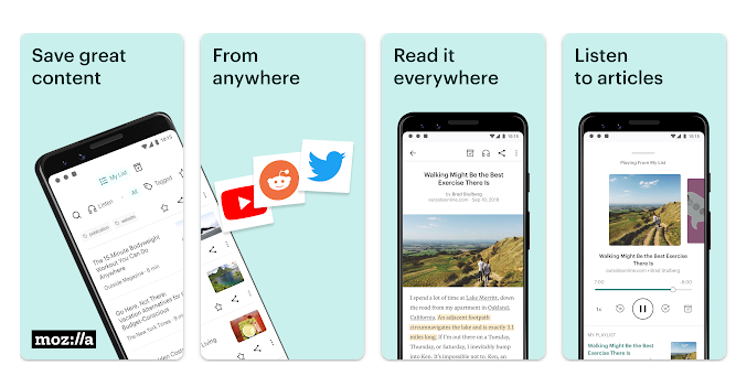
Pocket is a simple readers’ app that brilliantly serves its purpose. Here, users can easily save articles from the internet to read later, even without an active internet connection.
The best thing is that the app has won a Webby award for its UX design. When designing the app, they chose five people, took their feedback, and implemented that feedback in the design, and it simply clicked. The app looks uncluttered and clean. We need to bow down to the designers for once.
Pro tip: Uncluttered apps are considered to be the most pleasant apps to use where there is good use of white space, in moderation, that represents a clean look and makes the features and information on the mobile app more clear. What better way to attract users than with a clean looking app?
Know more: Listing Down 10 Currency Converter Apps For 2024.
10. Uber
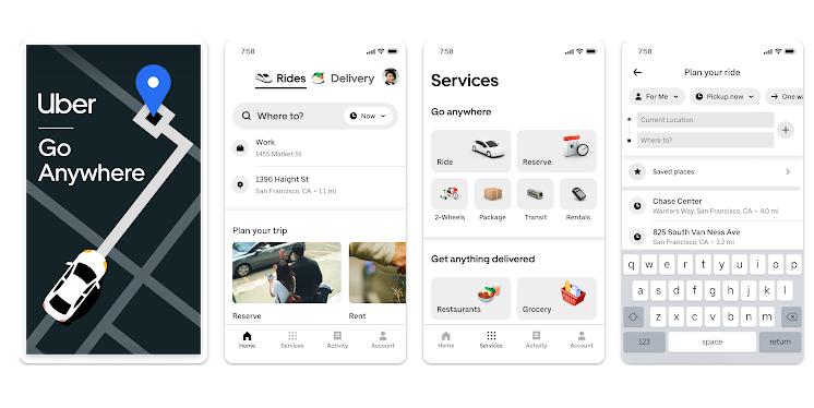
Last but not least, we had to add the Uber app to our list of top 10 mobile app UI designs because this is something many mobile app owners can learn from and gain the best inspiration from. Uber is one of the most used taxi-booking apps for a reason. While it serves its services well, the overall UI design is something to get a spark of information from.
The mobile app design uses white space to its advantage, making the app look clean and spacious. This ultimately makes the app’s navigation easier, as users can see the features more clearly. The simple and clean nature of this app’s user interface includes a search bar and map, and it allows you to find the best taxis near you and book them in an instant.
If you are interested in learning more about food delivery apps and how much they cost, you should check out our blog, “How Much Does It Cost To Develop A Food Delivery App Like Ubereats?” to get the best insights.
Over to You
It is important to remember that your mobile app design is the most important factor that will determine the number of users and downloads you get; this will measure the success of your mobile app. One mistake in the UX or UI could result in a long-lasting one. We have seen several mobile apps fail because either the right strategy was not implemented or the user interface was so badly done that one glace would make them not want to download the app, making that app either get lost in the sea of apps out there. Remember, if you have an app idea, so does your rival, and you will want to do something more that makes your mobile app actually worth downloading.
While these top 10 mobile app UI design ideas were to ignite and spark your creativity, they can be ideas at the end of the day. The real question here is, “How do I make my app better than this?”
If you are interested in creating an app that is similar to or better than this, the best option for you is to hire a professional agency that specializes in designing user-friendly mobile app designs and delivers an error-free mobile app design. Appsleagues is known for delivering unique mobile app designs in every industry; whether you are interested in healthcare apps, social networking apps, or education apps, our team of mobile app developers and designers knows how to deliver you an app that matches the aesthetic of your purpose. We specialize in designing apps for iOS, Android, and real native apps.
Our team delivers you with the best solutions and learns more about your competitor apps, even if they are a part of the list above. Our target is for your mobile app design to stand out and provide users with the best experience from your app, making them want to stay on the app longer and truly enjoy their time on the app. Our app designs are remarkable at first glance, delivering strong first impressions toward users. When it comes to user interface, our team works endlessly and effectively to provide you with the best UX/UI solutions. Our ultimate goal is for your audience to enjoy and remain satisfied with your mobile app.
